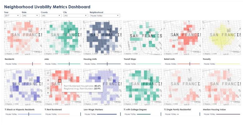
This research project proposes both an expanded set of “socialized” metrics to complement the physical neighborhood metrics typically used for TOD projects, and a new data visualization methodology for extracting and visualizing neighborhood metrics consistently and dynamically. With the addition of socialized metrics, designers will be better equipped to have conversations with clients and stakeholders on the nuanced and racialized impacts of urban design polices—and ultimately facilitate more equitable design outcomes for all.
The new data visualization methodology includes a simple dashboard for visualizing different metrics across six case study neighborhoods. The purpose of the dashboard is to provide a more dynamic and easy-to-update vehicle for analyzing neighborhoods, establishing precedents, and presenting findings both internally and externally. The dashboard was built using Tableau, and is currently in beta. As a follow-on to this research, we will continue to work on developing a more seamless dashboard interface, and uploading more neighborhood data into the database.
View the dashboard here.

